This was part of my entrance Portfolio for WWU! I got into the program with this work.
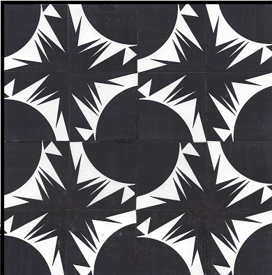
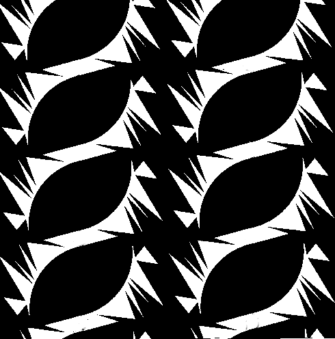
Shape repetition (curvilinear)
Dimensions:
Computer: 550 X 235 pixels
Actual: 21-5/8 X 8-1/2 inches
When did I do this? Spring 2003-2-D Design at Bellevue Community College
Rationale: This design has the technique of repetition by repeating the curve in all three squares. This technique gets the message across that each of these squares is related to each other because of the curvilinear shape. This design is also abstract to the original pictures we used in producing it.

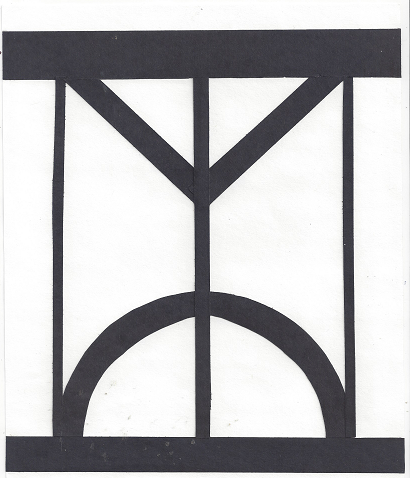
Watch Abstraction
Dimensions:
Computer: 300 X 570 pixels
Actual: 12 X 24-1/2 inches
When did I do this? Spring 2003-2-D Design at Bellevue Community College
Rationale: The three squares represent what an object, in this case a watch, looks like abstract. Simplifying the design of the original was the hardest part. The message is pretty clear through the use of subtle changes (three squares).
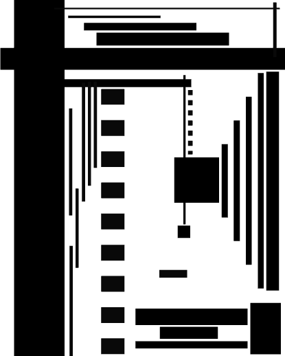
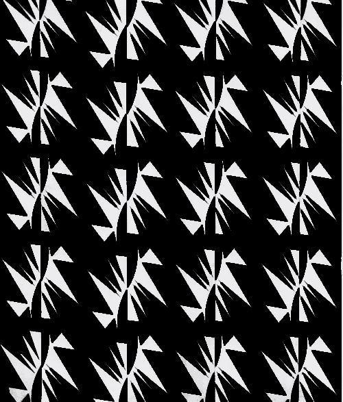
Repeating Symbol Assignment
Dimensions:
Computer: 1 (490 X 496 pixels) + 2 (500 X 587 pixels)
Actual: 1 (7-7/8 X 8 inches) + 2 (7-3/4 X 9-3/8 inches)
When did I do this? I did this in my 2-D class at Bellevue Community College.
Rationale: I used many techniques and materials to end up in this final product. The materials and hardware I used were: Xerox copier, rubber cement, rubber cement pick up. The process involved cutting out and arranging a shape to repeat. Then I xeroxed the element repeatedly and cut and pasted them onto a separate sheet. After I completed cleaning the design with the rubber cement pick up I Xeroxed the final. This project took many tasks; materials, and time to create. This design is also related to balance through the technique of repetition: it gives the appearance of being unified by repeating the same element.
Asymmetrical Line Design
Dimensions:
Computer: 415 X 518 pixels
Actual: 8-1/2 X 11 inches
When did I do this? Spring 2003-2-D Design at Bellevue Community College.
Rationale: This design is based on the concept of balance and unity. Each line, with different weights and sizes, impact the way we view equal balance in a designed element. This graphic in particular has many design features in it; for example, this design has the appearance of motion through variations of weights and lengths of line use. The asymmetrical balance in this piece is also evident in the size and use of the lines. The arrow, made by varied line lengths, on your right, captures the viewer at first glance; moreover, we follow the line through out the design. The focal point for this design is the box in the lower middle not grouped with all the other lines.
Here are some other artwork created in my art class at BCC!