Portfolio Navigation: Web Video Lumber Map Building Materials 2018 Map
Map Process Map layout Back of Map Map Showcase Map portfolio Gallery
Map Process Map layout Back of Map Map Showcase Map portfolio Gallery
Issaquah Lowe's Store Maps #0140!
Portfolio Navigation: Web Video Lumber Map Building Materials 2018 Map Map Process Back of Map.
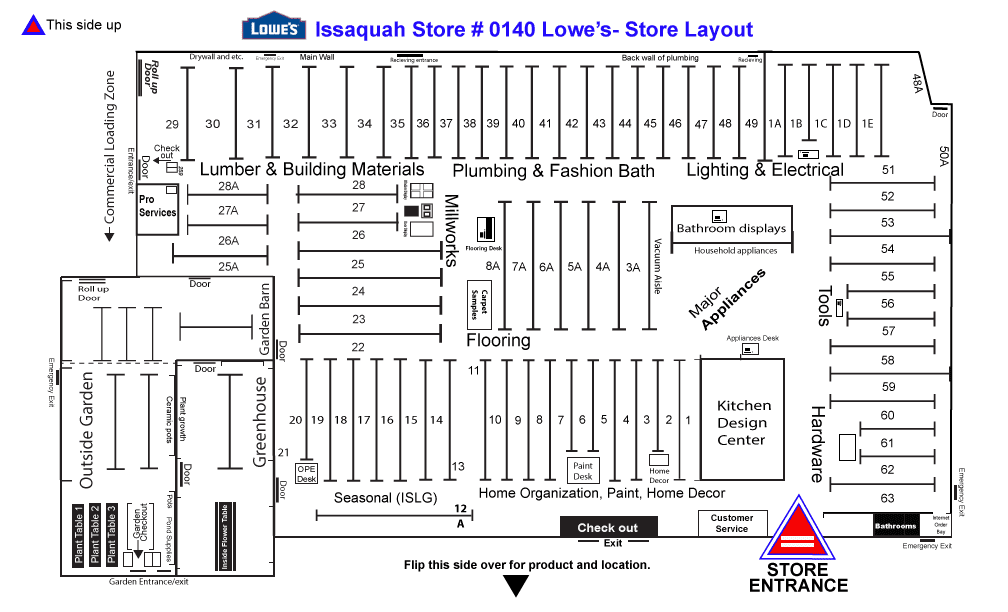
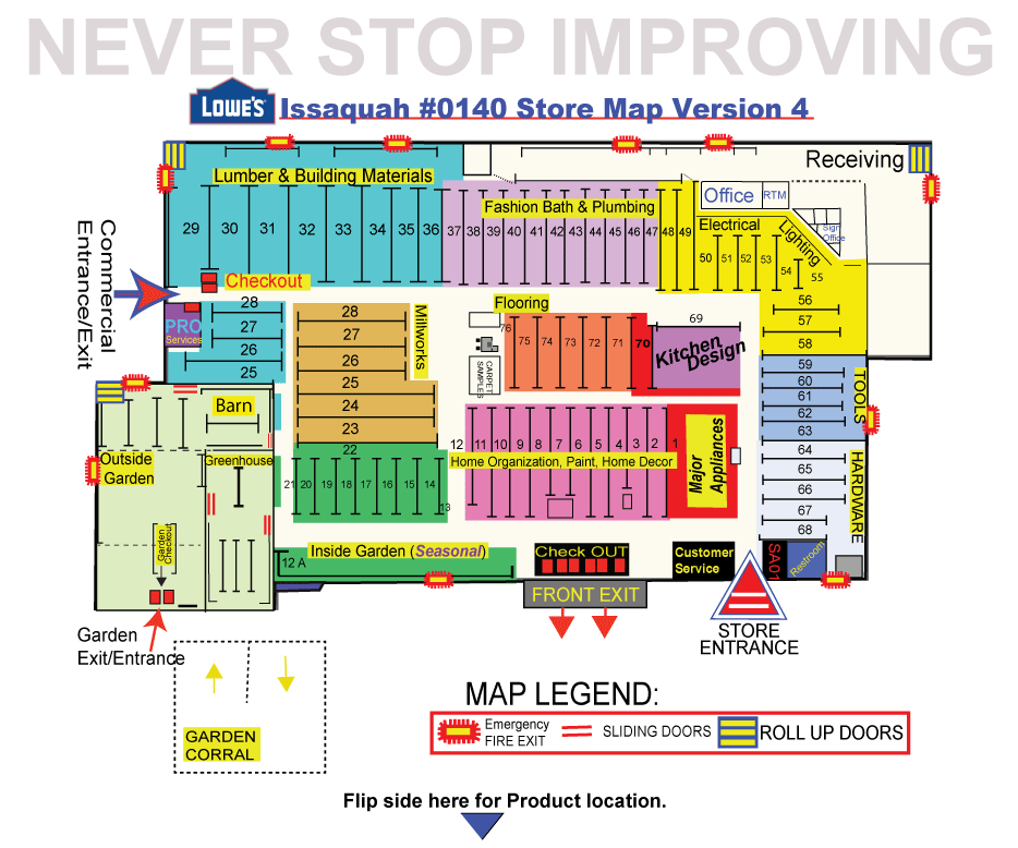
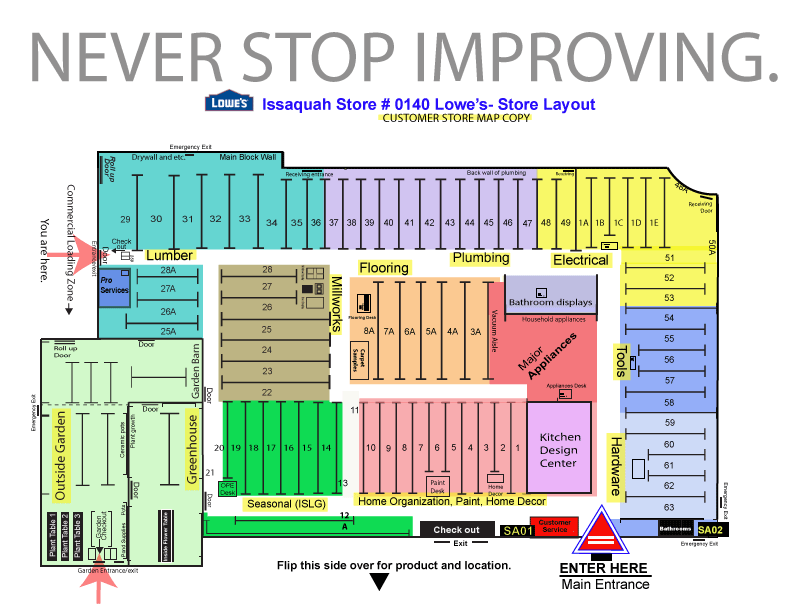
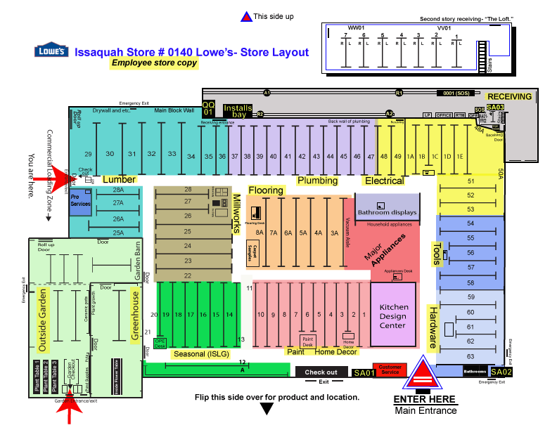
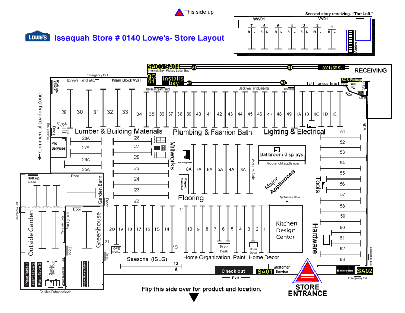
The Store Map was composed with a front (layout by aisle)and back sheet labeling the products by Aisle numbers and locations. Check out this page for all my final versions of the front of the Map and take a look at the back of the map above or here!
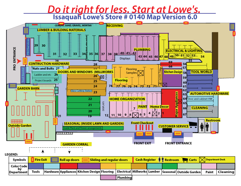
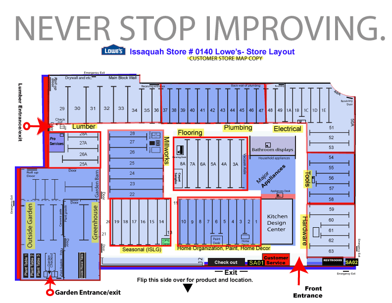
Final Version 6.0: Updated and Fnished to be printed and handed out to employees and customers alike.
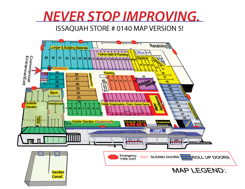
2/6/21- Version 5! This is a combination effort between the image above and the version 4 layout.
7/27/20-Version 4 Complete. Made my final corrections/editing and I'm calling it complete. It is now in the cashiers catalog book located in each cashier station. I also gave copies to my HR manager to hand out to any new hirers that need help navigating and directing customers throughout the store.
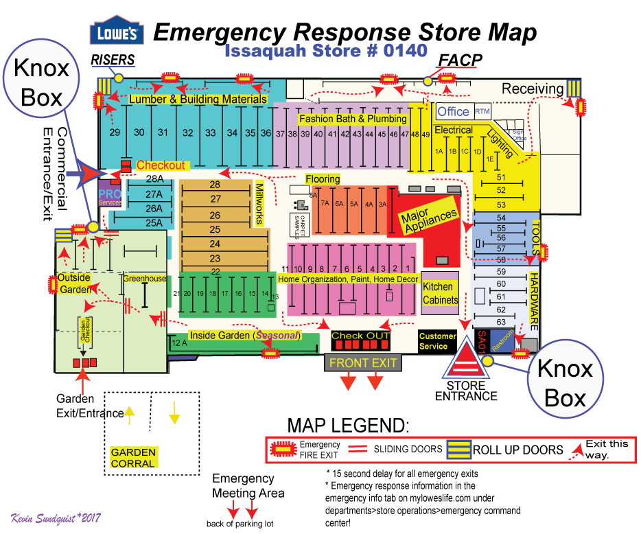
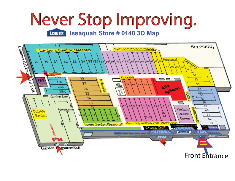
This was a map I designed in 2017 for my LP manager at Lowe's. This was printed poster size and posted three spots in the store. See more on my portfolio showcase above to see me.
7/24/17: This was a combination of several maps that originated from early "flat" graphics and an updated feel from my "3D" previous maps.
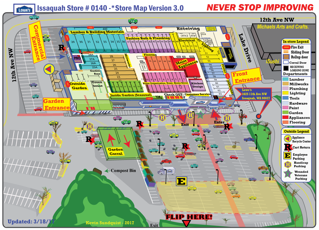
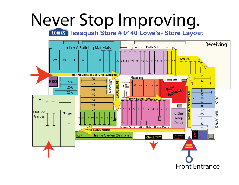
3/3/17-MY new and final map version 3.0 highlights and creates more of a 3D feel from my previous versions. This will be handed out to each fellow associates in the departments around the store. It contains both the map on the front as well as the product locator on the back.
Version 2.0 - I did my last and final version of the store map in late October 2016 where I included more detail about the store layout and door locations.
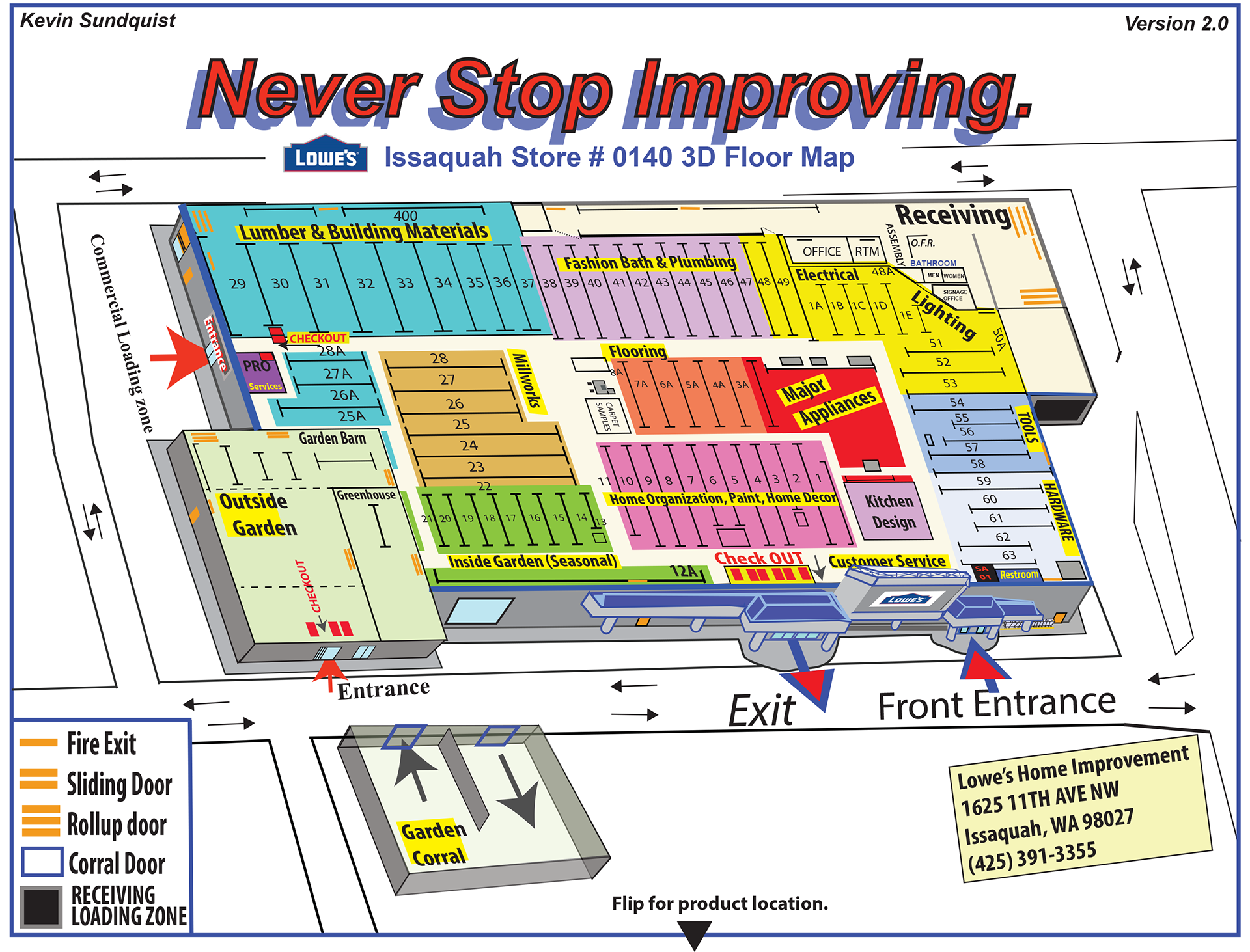
New Store MAP 3D! With Color. This is my final review for my new version. Nov. 2015
Version 3A: Floor map design - Using the floor map provided I created an updated map following my past map designs. Oct-Nov. 2015
The "digital" map was an alternative color scheme that introduced some updates as well as the "style" of the store colors and design.
Color Scheme "Digital"
Version 2.0 Color!!!
This is the final copy of the Customer Copy.
Here is a copy of the back of the color version. I added a water mark of the logo of lowe's in the background. I think it adds a certain touch.
Made a few changes here. Tried to make important parts of the store more readable and stand out. Here's for you Dan.
Verson 1.0- Black and white.